San Diego Anti-Displacement Study Existing Conditions Report
Updated 2023-06-01
1 Executive Summary
The Urban Displacement Project partnered with LeSar Development Consultants and the San Diego Association of Governments (SANDAG) to evaluate displacement risk in San Diego County for SANDAG’s Anti-Displacement Study. We used our robust Estimated Displacement Risk Model to determine which factors predict displacement and identify neighborhoods in the San Diego region with these characteristics.
In this report, we discuss our findings from the model, the driving forces of displacement, and which populations are most impacted.
We also acknowledge that this report examines contemporary patterns of residential displacement in San Diego County and does not address the violent removal of the region’s Native American population that followed the arrival of European settlers in the 16th century. Today, only a small percentage of the county’s Native American population live on reservation land, indicating that patterns of indigenous displacement are not exclusive to the past.1
While the analysis results presented help illustrate important dynamics of displacement in San Diego County, it is critical to also listen to the voices and lived experience of those impacted by displacement. Community engagement was embedded in every aspect of SANDAG’s anti-displacement study. SANDAG validated the data in this report and gathered additional information about the lived experiences of people who face displacement pressures or have been displaced from their homes. The project team met with SANDAG’s Social Equity Working Group and Community Based Organizations (CBO) Outreach Team, as well as with focus groups of community members across the region. Global Policy Leadership Academy (GPLA) supported the agency in conducting this engagement.
Several key themes emerged from the stakeholder engagement:
- Displacement is driven by (among other factors):
- rising costs of living (not only rent, but also utilities and high deposit requirements)
- widespread harassment and abuse by landlords
- lack of enforcement of limited renter protections, especially for undocumented people
- limited knowledge of renter protections/rights
- There is a need for regional resources to connect low-income renters with affordable housing options and resources
- Many families have relocated from the San Diego region to Mexico to escape high housing costs
Before proceeding, we want to acknowledge that the findings in this report are distressing, yet necessary to read. We want to remind the reader that these numbers represent the lives and experiences of individuals and families who have temporarily or permanently lost their home, impacting their health, safety, financial security, sense of community, and generational outcomes of their children.
We also want to remind the reader that this report is just one component of a larger solutions-oriented project. Our analysis, combined with research on effective anti-displacement strategies, robust community engagement, and the creation of a toolkit for action, will inform policies to address displacement in the San Diego region.
We draw a few main conclusions from our analysis:
- Displacement is a significant problem in San Diego County, not just in the city of San Diego but also in North and East County. Areas experiencing displacement are largely urban or suburban, whereas rural parts of the county are less affected.
- Almost all remaining affordable neighborhoods in the county are also experiencing displacement, meaning there are limited housing options for displaced families. This suggests that households are likely being forced to leave the San Diego region entirely.
- San Diego County has a severe lack of rental units affordable to households making less than 50% of the Area Median Income, putting them at risk of forcing them to “double up” with family or friends or spend too much of their incomes on rent. Steep increases in rent in recent years have put even more pressure on renters struggling to afford housing.
- While people of all races and ethnicities live in areas experiencing displacement, San Diego County’s Latino and Black populations are most affected. While there is strong anecdotal evidence that many of San Diego’s refugee and asylee migrant groups tend to live in areas experiencing displacement, reliable data is not available on these racial and ethnic groups.
2 The Estimated Displacement Risk Model
UDP’s Estimated Displacement Risk (EDR) model identifies varying levels of displacement risk for low-income renter households and families in all census tracts2 in the state of California. The model uses an advanced machine learning algorithm3 that combines unique consumer data from Data Axle tracking yearly renter mobility and census data to estimate displacement in a region. Displacement risk means that in 2019—the most recent year with reliable census data—a census tract had characteristics which, according to our model, are strongly correlated with more low-income renter population loss than gain. In other words, the model estimates that more low-income households left these neighborhoods than moved in. While this model uses 2015-2019 census data, which means that correlations between tract characteristics and low-income renter population loss are based on this time period, the prediction model is still relevant today.
This map should be considered as a tool to help identify housing vulnerability. However, the map has several limitations:
- Because the map uses 2019 data, it does not capture more recent trends. The pandemic, which started in 2020, has exacerbated income inequality and increased housing costs, meaning that our map likely underestimates current displacement risk throughout the San Diego region, especially given the significant rent increases that the county has experienced in recent years.
- The model examines displacement risk for renters only, and does not account for the fact that homeowners may also experience housing instability. As a result, the map generally highlights areas with relatively high renter populations, whereas neighborhoods with higher homeownership rates that may be experiencing displacement are not as prominent as one might expect. However, homeowners are more shielded from displacement in a variety of ways, including provisions of 1978’s Proposition 13, which generally limits annual increases in property taxes to 2%.4
- The model does not incorporate data on recent housing construction or infrastructure projects. The map therefore does not capture the potential impacts of these developments on displacement risk, it only accounts for other characteristics such as demographics, housing markets, economics, and some features of the built environment.
Given these limitations, we recommend that readers explore the additional map layers—such as Percent Low-Income—in addition to the displacement risk layers in order to gain a fuller understanding of the socioeconomic dynamics of San Diego County.
2.1 How to read the EDR map
The EDR map in the following section provides three layers of displacement information. The “Overall Displacement” map layer shows the number of income groups experiencing any displacement risk. For example, in the dark red tracts (“2 income groups”), our models estimate displacement (Elevated, High, or Extreme) for both income groups. In the light orange tracts categorized as “At Risk”, one or all three income groups had to have been categorized as “At Risk of Displacement”.
The “50-80% AMI” layer on the map shows the level of displacement risk for low-income (LI) households specifically. Since we have reason to believe that our data may not accurately capture extremely low-income (ELI) households, we combined ELI and very low-income (VLI) household predictions into one group—the “0-50% AMI” layer on the map—by opting for the more “extreme” displacement scenario.
For example, if a tract was categorized as “Elevated” for VLI households but “Extreme” for ELI households, we assigned the tract to the “Extreme” category for the 0-50% layer. For these two layers, tracts are assigned to one of the following categories. Darker red colors represent higher displacement risk and lighter orange colors represent less risk:
- Low Data Quality: the tract has less than 500 total households or the census margins of error were greater than 15% of the estimate (shaded gray).
- Lower Displacement Risk: the model estimates there is no displacement, or even growth, of the given population. Some of these tracts may be majority low-income experiencing small to significant growth in this population while in other cases they may be high-income and exclusive (and therefore have few low-income residents to begin with).
- At Risk of Displacement: the model estimates that displacement is probably occurring in the given tract, and if so, by only a small amount.
- Elevated Displacement: the model estimates a small to moderate amount of displacement (fewer than 100 more households in the given income group left than moved in).
- High Displacement: the model estimates there is a relatively high amount of displacement (between 100 and 200 more households in the given income group left than moved in).
- Extreme Displacement: the model estimates there is an extreme level of displacement of the given population (200+ more households left than moved in).
2.2 Additional Layers
We include four additional map layers related to demographic and economic conditions to highlight dynamics around low-income displacement in the San Diego region.
- Percent Low-Income: The percent of renters in a tract whose incomes are below 80% AMI.
- Affordable 80%AMI and Affordable 50%AMI: Tracts that are “Not Affordable”, “Less Affordable”, and “More Affordable” for the region’s low-income population whose incomes do not exceed 80% and 50% of the AMI, respectively. This measure calculates the total number of low-income households in San Diego County and compares the respective population size to the number of rental units in a tract that these families can afford without spending more than 30% of their income on rent. The “Not Affordable” layer means that there are very few, if any, homes in the tract that a household can rent without being rent-burdened. “Less Affordable” means there are a few rentals available to low income households without being rent burdened while “More Affordable” means there is a large number of homes that low-income households can afford without being rent-burdened.
- Segregation: This layer highlights all racial and ethnic groups that account for more than 10% of a tract’s total population. For example, a Mostly White tract means that the tract is majority White and all other groups are less than 10% while a Latino-Black tract has more than 10% Latino composition and more than 10% Black composition and all other groups are below 10%.
- Percent Black: The percent of residents in a tract who are Black. This layer was added because to higlight areas with high proportions of Black households, since there were no “Mostly Black” neighborhoods in the “segregation” layer. The large Black population in the census tract towards the bottom of the map, in Otay Mesa, may be due to the fact that there is a prison in the tract, since Black people are incarcerated at disproportionately high rates compared to other races/ethnicities.5
2.3 Other Overlay Layers
We also provide several “overlay” layers to aid in the interpretation of displacement in the region.
- Displacement: A hatch layer showing “Overall Displacement” (the same as the first layer), so it can be viewed at the same time as other layers.
- Redlined Areas: Neighborhoods that were historically redlined in the 1930s (this data was pulled from the University of Richmond’s Mapping Inequality project). Redlining established and reinforced racial residential segregation, particularly disadvantaging Black households, which created massive racial wealth and homeownership disparities that persist to this day. However, some of these formerly redlined areas have experienced significant demographic changes. For example, much of Southeast San Diego has become more racially diverse as Latino households and households of other racial and ethnic groups have moved into the area.
- Student Population: Tracts where more than 30% of the population are students. Students often have low wages and high migration rates, which means the model may overestimate actual displacement risk in these areas. However, these tracts still may be experiencing displacement among low-income residents who are not students.
- Retired Population: Tracts where more than 40% of the population is retired. Retired individuals often have stable housing despite their low wages, so the model may overestimate displacement risk in these areas because retirees’ lower incomes generally lead the model to estimate higher displacement risk.
- Military Infrastructure: Tracts with military bases or other military infrastructure. The model may overestimate displacement risk in these areas due to high in- and out-migration rates among people associated with the military.
- Roads: Major highways in the area.
- Mobility hubs: Vibrant centers of activity, roughly 1- to 3-square miles in area, where future transit and other mobility options, as well as future growth and development are anticipated by the 2021 Regional Plan.6
- Transit Leap: Corridors along which fast and flexible transit exists or is anticipated by the 2021 Regional Plan.
3 Displacement risk is widespread
Click on a tract to view more information about displacement risk, demographics, and economics.
3.1 Displacement in San Diego County
Click on one of the first three layers to see displacement risk for different income groups. While displacement risk is visibly more widespread for extremely and very-low income renters (see the “0%-50% AMI” map layer) than for low-income renters (“50%-80% AMI”), displacement risk for both of these groups generally shows up on the map in similar places.
Displacement risk appears to be significant in the area that stretches from just southeast of downtown San Diego (between Barrio Logan and Mount Hope/Valencia Park) to Chula Vista, Imperial Beach, and San Ysidro to the south. Normal Heights and City Heights are also highlighted, especially for the lowest income group.
Other areas experiencing displacement risk are La Mesa, Lemon Grove and El Cajon in East County, and Oceanside, Vista, San Marcos and Escondido in North County.
3.2 Low-income households
Click on the “Percent Low-Income” layer as well as the “Displacement” overlay to see that there is significant overlap between tracts where low-income households (80% AMI or less) live and tracts that are experiencing displacement. In other words, much of the displacement in San Diego County is occurring in neighborhoods with large low-income populations.
3.3 Affordable markets
Selecting the “Affordable 80% AMI” layer shows that in 2021, there were some census tracts dispersed throughout the county, mostly in the city of San Diego, that had a substantial supply of rental units affordable to renters whose incomes are 80% AMI or below. In other words, low-income households are more likely to be able to find rental housing at their price point in green tracts compared to yellow and red tracts. Many of these tracts are located in the city of San Diego, although they also exist in other neighborhoods and in East and North County cities.
However, adding the “Displacement” overlay reveals that most of these tracts are also experiencing displacement risk, meaning there are very limited areas with affordable rental stock that low-income households can move to if they are displaced. As a result, families are likely to either leave San Diego, “double up” with other households, enter into homelessness, or move out of the region or even state.
Selecting the “Affordable 50% AMI” layer shows that in 2021, there were only a few tracts with substantial rental supply affordable to extremely- and very low-income households. These households have the fewest housing options if they are displaced.
3.4 Segregation and redlining
Selecting the “Segregation” layer with the “Displacement” overlay shows that most census tracts where the majority of the population is Latino—generally concentrated southeast of downtown San Diego and south towards Mexico—are experiencing displacement risk. All of the tracts in Southeast San Diego with significant Black and Latino populations are experiencing displacement risk. Many other displacement neighborhoods are primarily White and Latino.
Selecting the “Redlined Areas” layer shows how neighborhoods in the City of San Diego were “redlined” in the 1930s (the map is unavailable for other parts of the county). Redlining was the discriminatory practice of outlining majority non-White parts of a city as risky for investors and those offering low-interest home loans, resulting in disinvestment in non-White neighborhoods and excluding non-White families from the opportunity to buy homes and build wealth. This contributed to massive wealth and homeownership gaps between White families and Black, Latino, Indigenous, and families of color (see this report for more). While redlining was just one of many racist practices in housing, such as blockbusting, real estate steering and racially restrictive covenants, redlining is a useful proxy that reveals the lasting impact of racist housing practices on the housing landscape today.
However, redlining does not always equate to current economic or racial segregation. In some cases, gentrification may alter a formerly redlined area, displacing Black and households of color, transforming its demographics and generally resulting in a whiter and wealthier population.
This layer shows that many of the neighborhoods that were deemed “Hazardous” (grade D), mostly located in Southeast San Diego, have relatively high concentrations of Latino and Black residents today. There is also significant overlap between neighborhoods that were given this designation and neighborhoods that are experiencing high displacement risk.
Neighborhoods deemed “Definitely Declining” (grade C) are mostly in San Diego’s Uptown and Mid-City neighborhoods. Similarly to the “Hazardous” neighborhoods, the areas with this “Definitely Declining” designation that currently have a higher proportion of low-income people (City Heights and Normal Heights) are facing elevated levels of displacement risk, while wealthier areas to the west that were given this designation are experiencing less displacement risk.
3.5 Areas with existing or planned transit
Selecting the “Mobility Hubs” overlay shows areas designated in SANDAG’s 2021 Regional Plan as future connection points where key transit improvements will be made and most of the region’s future housing development is planned to be built. The Regional Plan describes Mobility Hubs as “vibrant centers of activity where transit and on-demand travel options, supported by safe streets, connect people with their destinations and businesses with their customers.”7 This layer is added because transit-oriented development has been viewed as a potential contributor to gentrification, although not all studies have found transit to have strong impacts on neighborhood change.8
It is important to note that many of the Mobility Hubs are in areas with significant displacement risk, particularly the Hubs south of the 8 and in El Cajon, Escondido, San Marcos, Vista, and Oceanside. Almost all of the areas experiencing displacement are contained within Mobility Hubs. There are several Mobility Hubs, however, in areas with lower displacement risk, including Encinitas, Solana Beach, La Jolla, Sorrento Valley, Carmel Valley, Coronado, Kearny Mesa, Eastern Chula Vista, and Rancho Bernardo. This suggests that SANDAG’s Mobility Hub planning could consider the different displacement risk borne by the community around each Hub area. By avoiding a one-size-fits-all approach to planning Hubs, SANDAG and localities can plan future connection-rich areas to consider displacement risk and vulnerable populations.
Selecting the Transit Leap overlay shows the region’s network of fast, high-capacity, high-frequency transit services in the region. This includes existing and planned light rail and commuter rail lines that the Regional Plan describes as “connect(ing) major residential areas with employment centers and attractions throughout the San Diego region.”9 Much of the Transit Leap routes shown in the map correspond with Mobility Hubs and areas with displacement risk. This includes planned commuter rail lines that run through the South Bay, Southeast San Diego, City Heights, El Cajon, and other areas with a high risk of displacement. Transit Leap areas also include areas with lower displacement risk, similar to the areas identified above in Mobility Hubs. Thus, as the region anticipates transit expansion along these corridors, it can analyze local displacement risk where expansion is planned.
4 What factors lead to displacement?
A lack of affordable rental supply in San Diego County and increasingly out-of-reach rent prices lead to unstable housing situations and rent burden, especially among lower-income residents. These unstable housing conditions can lead to displacement.
We want to again acknowledge that the information illustrated on the map represent the lives and experiences of individuals and families who have temporarily or permanently lost their home. Displacement has far-reaching negative consequences, and its effects can last for generations.
4.1 There is not enough housing for the lowest income renters
Figure 1 below on the left shows the number of renter households in San Diego County between 2013 and 2019 (note that the income ranges in the legend are from 2019). In 2019, moderate income renters were the most populous renter group (171,450 renters), followed by high (135,788), extremely low (102,875), low (68,461), and very low income renters (44,219).
The graph below on the right shows the number of rental units that are affordable to each income group. The number of units in each “band” of color represents the number of units that are within the specific price range for each group. In other words, high income households can afford not only the units represented by the orange band at the top of the graph, but also all of the other units underneath it. On the other hand, extremely low income households can afford only the units represented by the red band at the bottom or face higher cost burdens if they live in a more expensive rental unit.
Figure 1. Rental housing units affordable to each income group
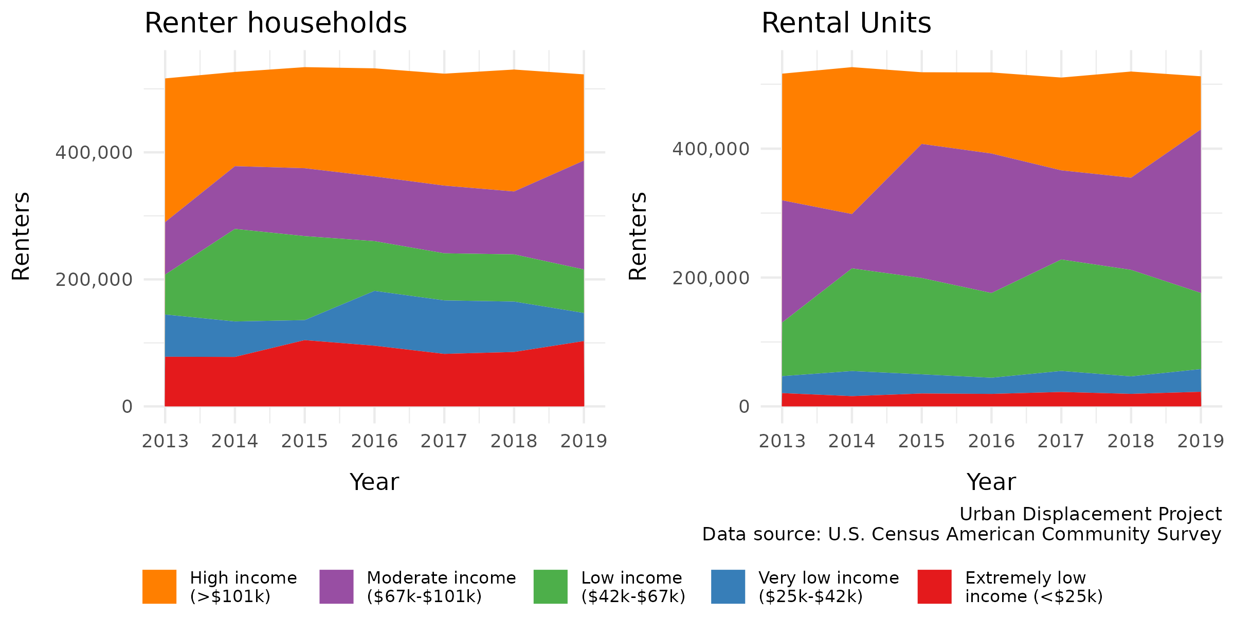
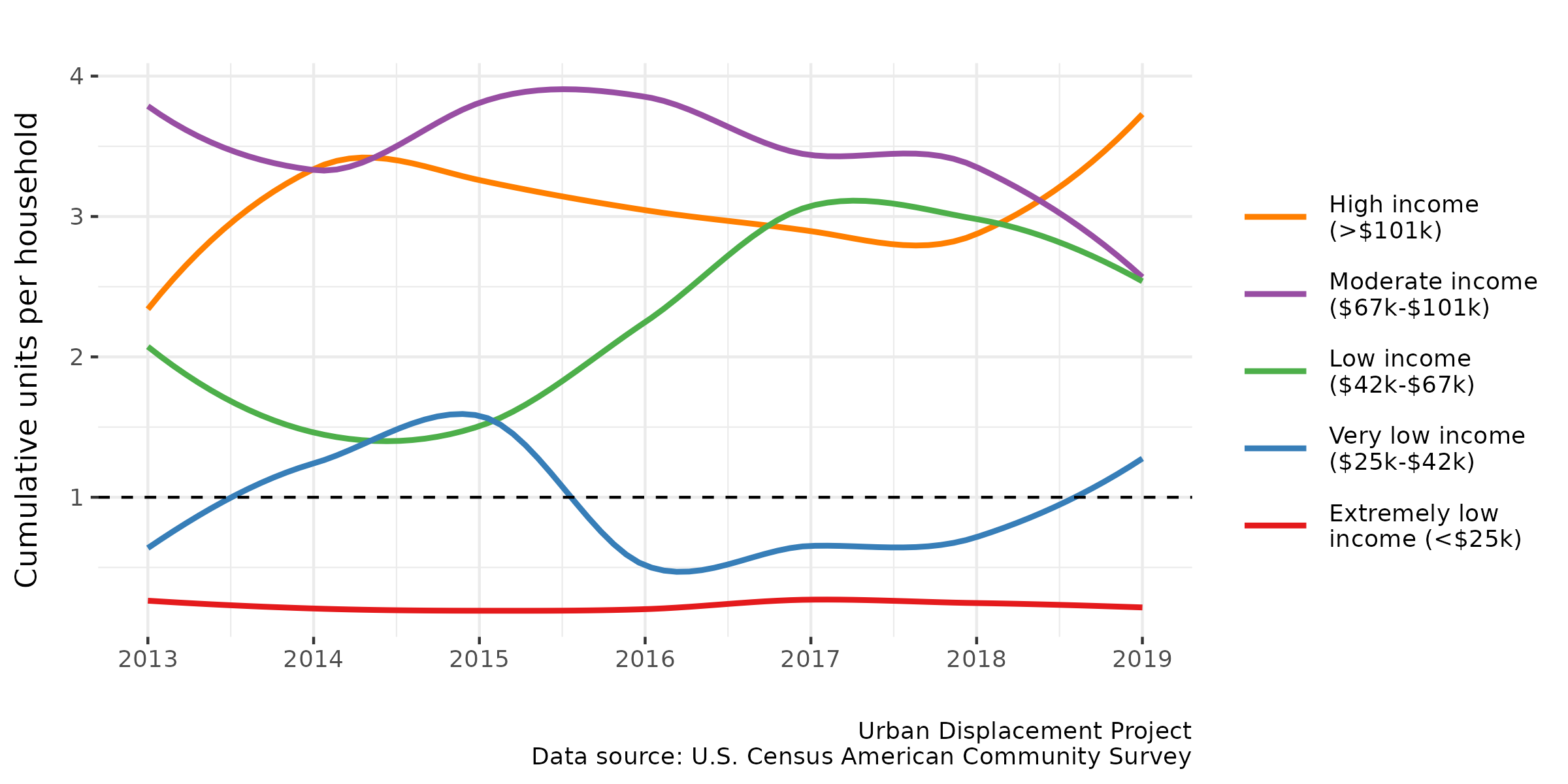
Figure 2 shows how many total rental units are affordable to households within each income group, demonstrating the relationship between different segments of the population and the rental market.10 In this graph, “total rental units” includes all units that households in the income group can afford without spending more than 30% of their income on rent. In other words, this number represents the entire rental housing stock that is affordable to the income group, including units that are below their specific price point.
This mismatch in rental units to income levels was echoed in community focus groups. Community members shared their frustrations with the lack of affordable housing options in their communities. One resident shared that “it feels like they are trying to completely push us out of society — there is nowhere left to go,” indicating a sense of hopelessness about the possibility of accessing affordable housing.
If a colored line is above the dashed line set at a ratio of one (1), it means that there is a surplus of homes available to this income group. For example, the purple line indicates that in 2019, there were roughly 2.5 affordable rental units for every moderate income household (making between $67,000 and $101,000 per year). The ratio for high, moderate, and low income households was consistently above one from 2013 to 2019, meaning there was a sufficient number of rental units affordable to these households.
On the other hand, the lowest income households have severely limited housing options. From 2013 to 2019, there were consistently fewer than 1/3 affordable rental units or fewer for each extremely low income household, meaning most of these households have no choice but to spend more than 30% of their income (and likely much more than that) on rent, or “double up” and live with family or friends. There was also a deficit of units affordable to very low income households for most years during this time period. While the people represented in this plot live in a home in San Diego County, somehow making ends meet, the plot does not include those who have been displaced—either entering homelessness or leaving the county altogether—due to high housing costs.11
Figure 2. Ratio of affordable units to households
4.2 More than half of renters are rent burdened
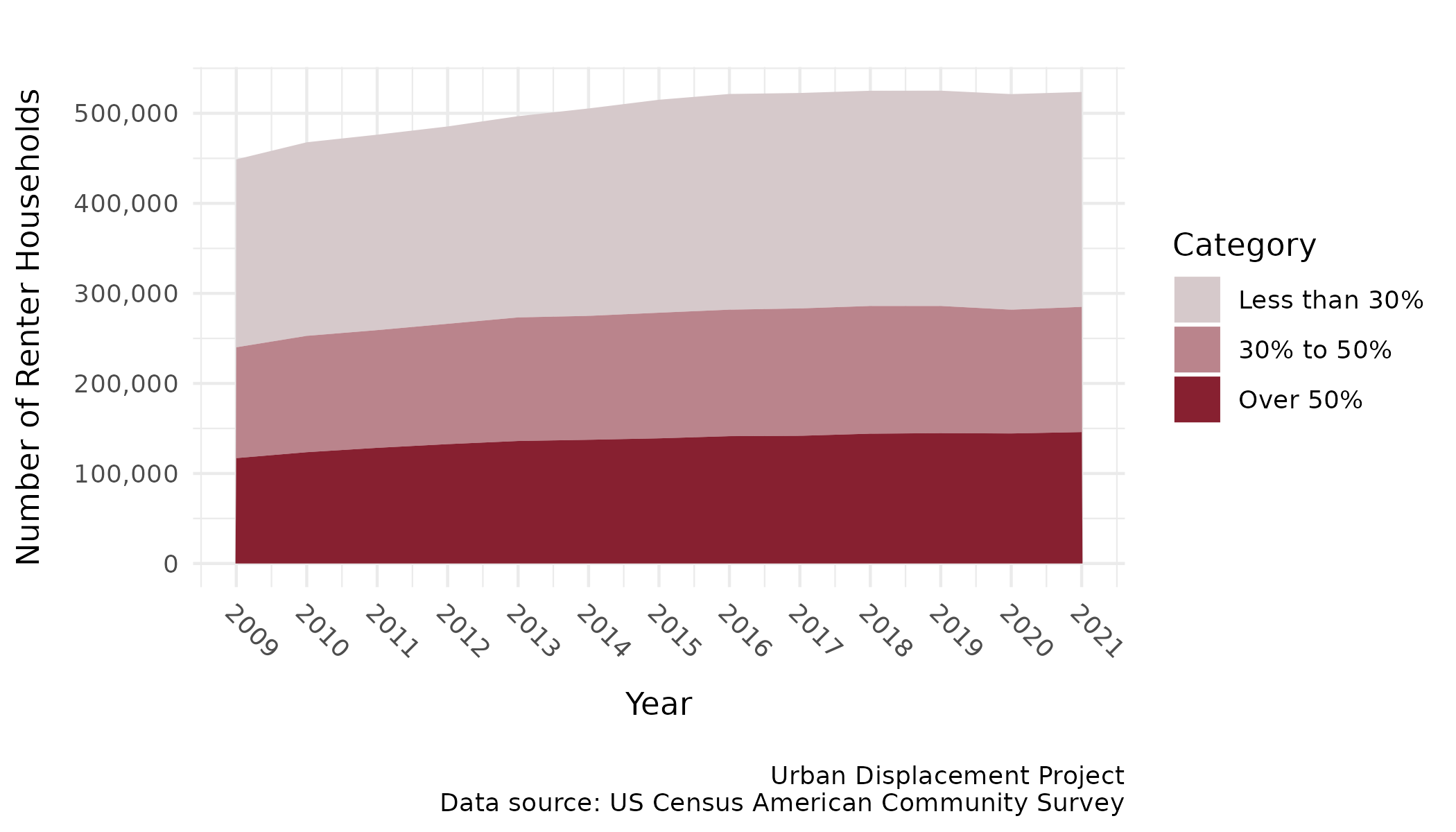
Figure 3 shows the number of renter households that are rent-burdened in the county. In 2021, more than half of all renters were spending more than 30% of their income on rent, and more than a quarter of renters spent over 50% of their income on rent. Families in this last group—considered “severely rent-burdened”—are most likely to be impacted by displacement and are at highest risk of eviction and homelessness.
While the calculation for cost burden only accounts for rental costs, community stakeholders reported spikes in the cost of utilities, such as natural gas, electricity, and water that add to existing displacement pressures. Focus group members also shared how transportation concerns can combine with housing costs to amplify displacement pressures when transit might not be reliable, safe, or quick enough to get people to work.
Figure 3. Rent burden
4.3 It is increasingly difficult to afford housing
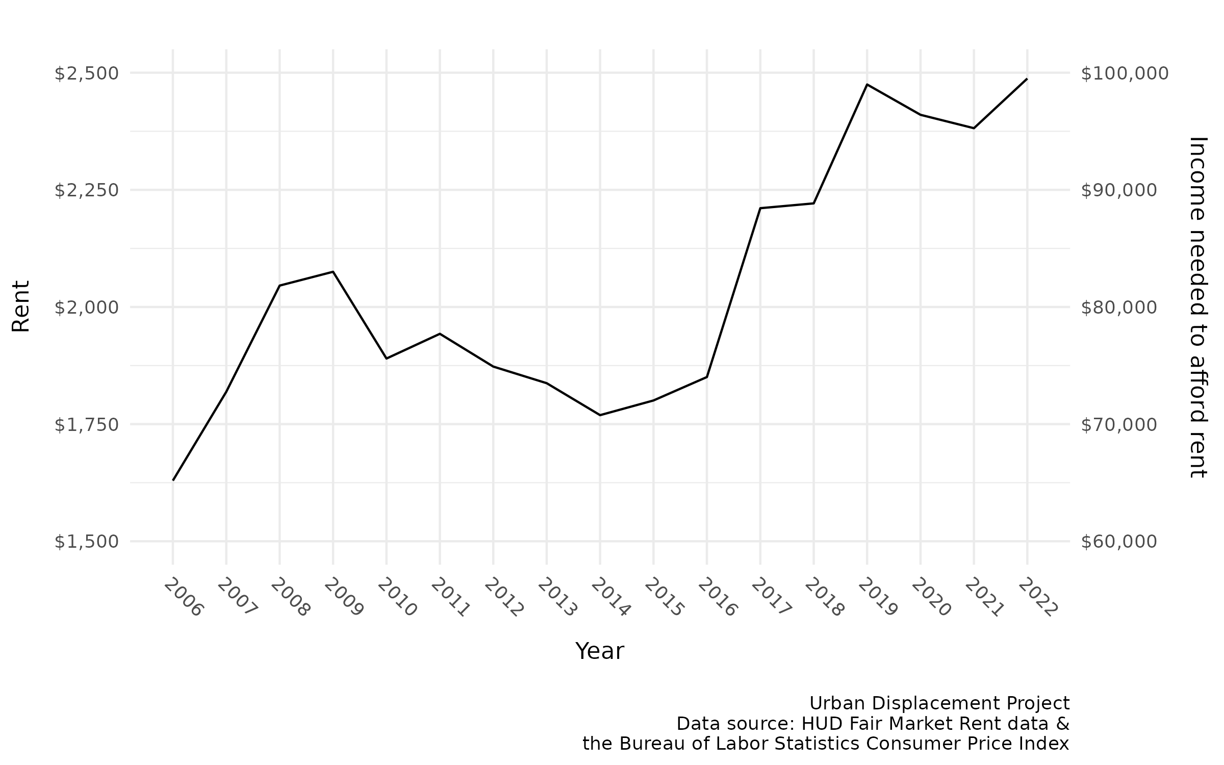
Figure 4 shows changes in the San Diego County rental market since the Great Recession. We can see that there was a steep increase in rent between 2014 and 2020, roughly the period when the U.S. market recovered from the housing crisis, followed by a slight decrease during the pandemic, on through 2022. From 2014 to 2019, San Diego County experienced a 43% increase in rent, making it significantly more difficult for households of all incomes to afford housing. Between 2019 and 2022, rents decreased by only 10% during the pandemic, matching 2018’s market price.
The right hand side of the graph indicates how much money a household must make per year (before taxes) to afford a rental unit at a given price point without spending more than 30% of their income on rent. The average fair market rent12 in San Diego County increased from $1,629 in 2006 to $2,475 in 2019 (and dropped to $2,206 by 2022). The income required to afford this average rent increased from $65,178 to $98,996 in 2019 (and decreased to $88,224 by 2022). In 2021, fewer than 30% of renter households had a high enough income to afford the $2,382 average rent.
Since these are the average values for all unit types, families with children who need multiple bedrooms likely must pay even higher rents to find suitable housing. This puts families at a disadvantage in the housing market compared to single people and couples without children, who may be more able to find options in their price range.
Figure 4. Change in rent and required income to afford rent over time
5 Who is impacted by displacement?
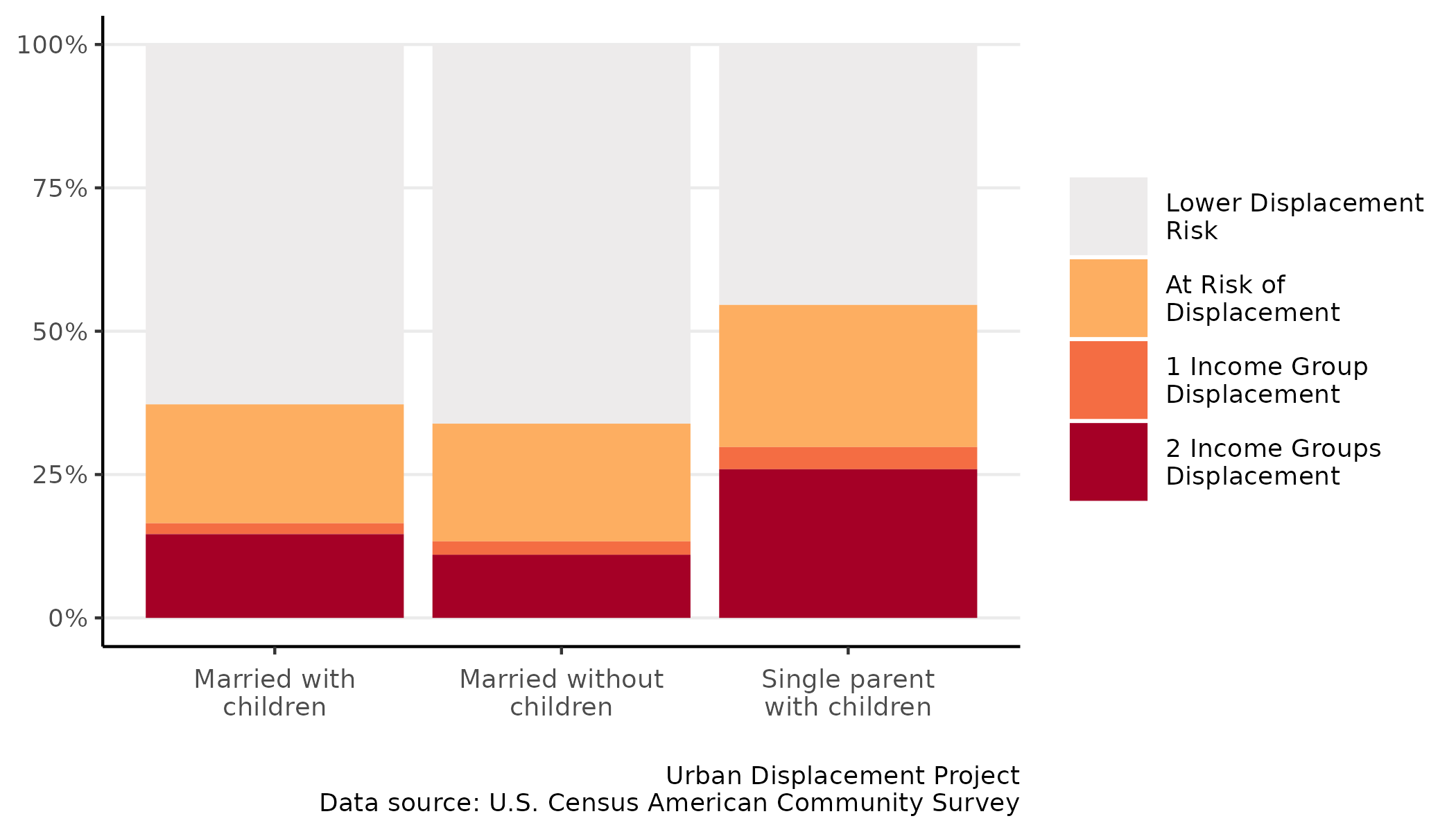
5.1 Families
As shown in Figure 5, almost 40% of San Diego County’s households that consist of a married couple with children (including owners and renters of all income levels) live in tracts experiencing displacement risk. Single parents with children are even more vulnerable, with more than half living in tracts experiencing displacement.
Figure 5. Distribution of families by type
Families that took part in the community focus groups shared doubts about their continued ability to raise children in San Diego. Many weighed leaving and the disruption this would have on their sense of community, their children’s schooling, but felt they had few options. One participant in a community focus group, a mother, said her home was dilapidated, the ceiling caved in, and her landlord refused to make repairs or other arrangements for her family. Instead, she had to rely on makeshift repairs and live in hazardous conditions due to the lack of other affordable housing units to move into.
5.2 Latino and Black households are disproportionately impacted
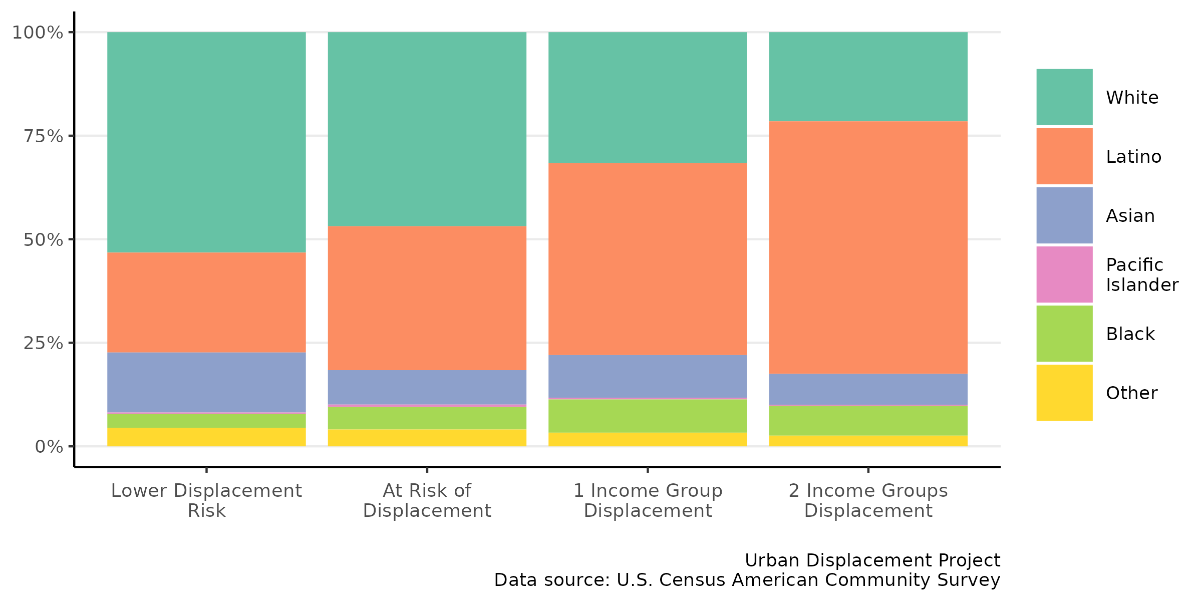
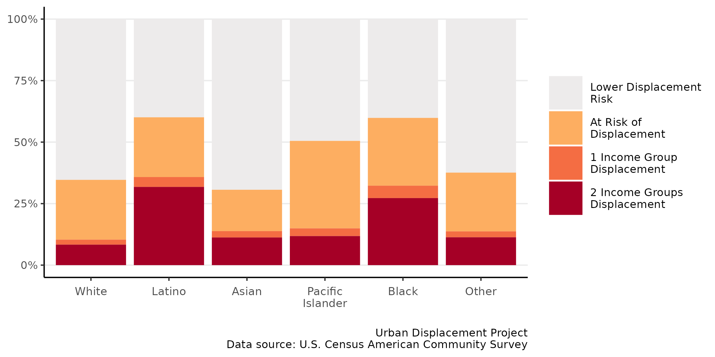
There are also racial and ethnic disparities in displacement risk. For example, according to Figure 6, tracts with lower displacement risk tend to have a higher percentage of White households than tracts experiencing displacement, while Latino households make up a disproportionate share of households in tracts experiencing displacement.
Figure 6. Population by racial/ethnic group within displacement tracts
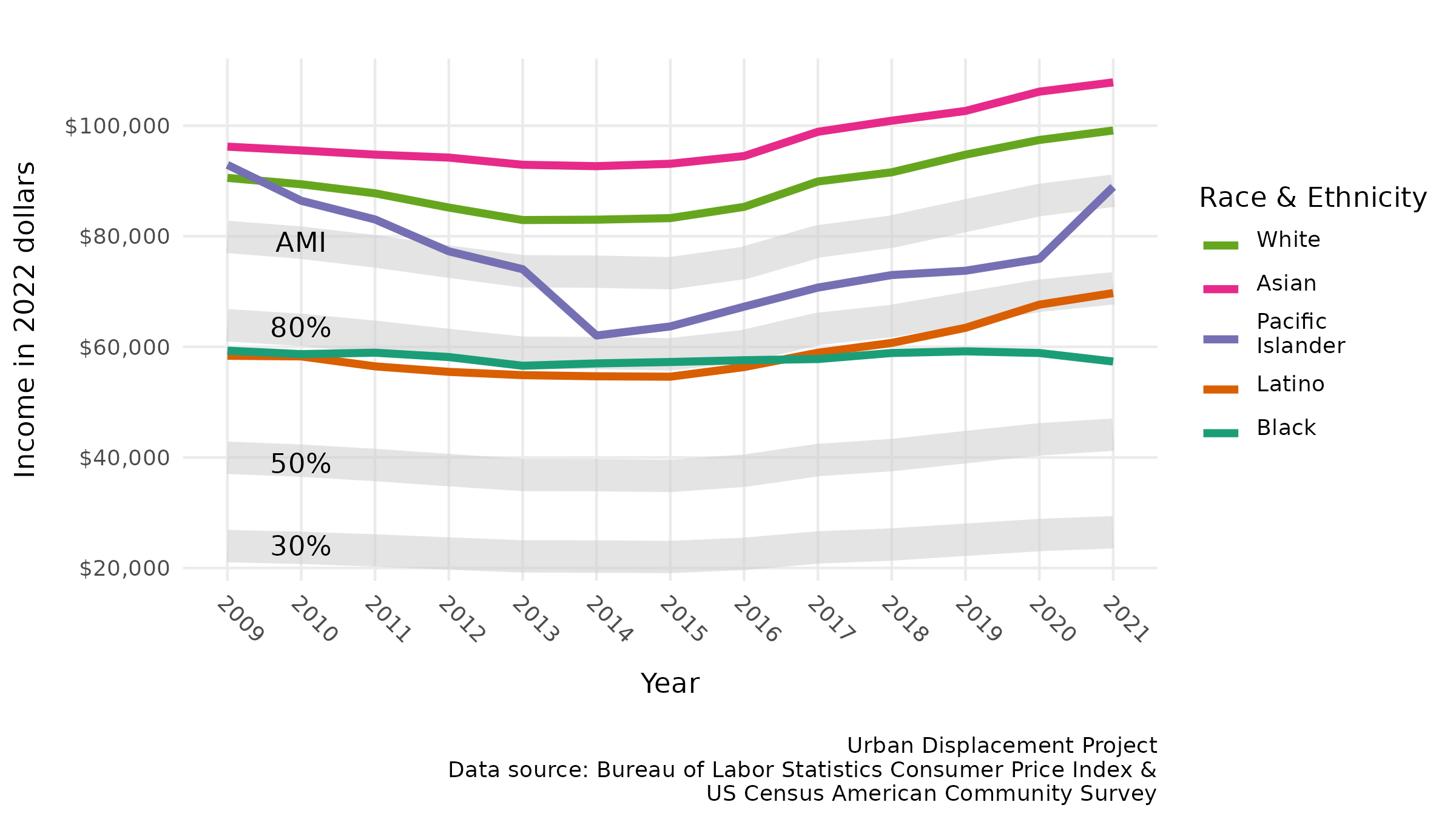
To illustrate how each racial/ethnic group is economically positioned in the San Diego housing market, Figure 7 shows the median income for all households (both renters and homeowners) within each racial/ethnic group.13 The gray bands represent the overall area median income (AMI) for all groups, as well as income thresholds that determine whether a household is considered “low-income” (<80% AMI), “very low-income” (<50% AMI), or “extremely low-income” (<30% AMI) by HUD standards.
The pink line at the top indicates that Asian households have consistently had the highest median income ($107,832 in 2021) among all the racial/ethnic groups, although it is important to note that this statistic hides significant economic disparities within the Asian community. White households have the second highest median income ($99,131), followed by Pacific Islanders ($88,936).14
Latino and Black households have consistently had similar median incomes, with Latino incomes surpassing black incomes slightly in recent years ($69,724 versus $57,347). The average household in both groups would be considered low income, making just below 80% AMI.
It is important to note that this graph does not show the impact of the pandemic, which began in 2020 and disproportionately affected low-wage workers. Households that already fell below the 80% AMI threshold and experienced rent burden before the pandemic likely suffered the most, despite the fact that rents decreased slightly (see Figure 4).
Figure 7. San Diego County median incomes by race/ethnicity
While people from all racial/ethnic groups in the county live in areas experiencing displacement (see Figure 8 below), Latino and Black households are most likely to live in a tract experiencing displacement risk (roughly 60% for both groups). In comparison, approximately a quarter of San Diego County’s White and Asian population and almost half of its Pacific Islander population live in tracts experiencing some level of displacement risk.
These data do not specify San Diego’s refugee and asylee populations, largely from Africa, Central America, the Middle East, and Southeast Asia. These populations tend to live in areas with some of the highest displacement risk. A close examination of displacement risk among these racial and ethnic groups is not possible with existing data.
Figure 8. Distribution of racial and ethnic groups across the county
6 Themes from stakeholder engagement
This section summarizes the main feedback heard from community stakeholders. As described in the Executive Summary, the project team met with SANDAG’s Social Equity Working Group and Community Based Organizations (CBO) Outreach Team, as well as with focus groups of community members across the region.
6.1 Lack of enforcement of limited renter protections, especially for undocumented people
Community members that lacked a permanent or legal status shared a perception that they were unable to take advantage of renter protections because of their precarious legal status in the country. Those who had legal status shared that they were confused by what their rights were, had trouble accessing their local jurisdictions’ rules in their language, and that the mechanisms for enforcing the law put them at a heavy disadvantage. This last point was a point of consensus amongst the vulnerable populations that were interviewed, who did not feel empowered or financially able to use the court system as a way of enforcing their rights and risk destroying their credit or being forcibly evicted in the process. The court system did not seem to be considered a viable way to protect themselves and some community members described relying on informal support networks, non-profit organizations, or tenants’ unions to enforce their rights.
6.2 Limited knowledge of renter protections/rights
Respondents to the various stakeholder engagement sessions had mixed understanding of their protections and rights and described difficulties interpreting the law, delineating between state and local rules, and finding translations of local rules in their language. State law and local ordinances require high levels of legal literacy because they are not written in lay terminology, which creates barriers to enforcing tenant protections.
6.3 Need for regional resources to connect low-income renters with affordable housing options/resources
Community stakeholders also reported difficulty navigating the services available to renters on a regional scale. Because communities do not neatly fall within jurisdictional boundaries, regional resources like affordable housing directories could benefit a single community that spans multiple jurisdictions. The confusing and ad-hoc nature of the different resources and tools means that one set of rules can apply to one side of the street but not the other. The inconsistency of resources paired with a lack of regional transparency on accessing limited supply of affordable housing further complicates renters’ search for housing security.
6.4 Displacement through a binational lens
San Diego County is part of a larger California-Baja California binational megaregion that is characterized by crossborder travel and bilateral trade. As a binational region, both sides of the border participate in an economic, social, historical, and cultural exchange of people and goods crossing the international border daily. There is emerging evidence from cross-border travel data that points to housing being part of the megaregion’s binational exchange.
Travel patterns, gleaned from the Bureau of Transportation Statistics (BTS) Border Crossing Data, illustrate this phenomenon. On March 21, 2020, travel restrictions imposed by the federal government in response to the COVID-19 pandemic went into effect and limited access into the U.S. to only essential travel, trade, and U.S. citizens and residents returning home. There were thousands of people who were crossing the border into the U.S. each day through the San Ysidro, Otay Mesa, and Tecate ports of entry at a time when access was mainly limited to U.S. Americans.
Although there is not comprehensive data that can directly link these travel patterns to international displacement, this relationship is supported by qualitative evidence collected through stakeholder outreach engagement. Numerous community members shared stories about someone they know who moved to the Tijuana Metropolitan Area to access more affordable housing while also crossing the border each day into the U.S. to participate in San Diego’s labor force. This apparent displacement of households from San Diego into Baja California reinforces the binational nature of the megaregion.
6.5 Rising costs of living; not just rent but also utilities and high deposit requirements
Participants confirmed this report’s findings about rising rents, and described increases being announced without notice and in amounts that are in violation of state rent stabilization regulations. Beyond rising rents, renters are facing other rising costs: high deposit requirements, spikes in utility and gasoline prices, and new fees charged by landlords to cover utilities that were previously included in rent (e.g., water and trash).
6.6 Widespread harassment and abuse by landlords
Focus group members shared stories of widespread abuse by landlords, including predatory practices, threats of eviction, and manipulation of no-fault eviction exemptions to displace residents (for example, because of remodels or because landlords want to rent to family members). Many tenants shared stories of poor conditions and the looming threat of eviction, retaliatory fees, or rent increases by their landlords.
See https://www.sandiego.edu/native-american/reservations.php for details on the region’s Native American people.↩︎
A census tract is a geographic area with 1,200 to 8,000 inhabitants, with an optimum size of 4,000 people. See the U.S. Census glossary for more.↩︎
We use a Bayesian Additive Regression Tree (BART) model to examine net migration rates (i.e., displacement) of low-income households while controlling for hundreds of census variables related to displacement. The BART model provides a list of the variables that are driving displacement, of which we use to map the predicted risk of displacement from the different levels of these variables at the census tract level.↩︎
https://lao.ca.gov/reports/2012/tax/property-tax-primer-112912.aspx↩︎
Gentrification, Displacement, and the Role of Public Investment; Transit Oriented Development and Commercial Gentrification; Transit-Oriented Displacement or Community Dividends?↩︎
Note that these numbers were adjusted to 2019 dollars using the consumer price index.↩︎
See this helpful explainer video for more on this topic.↩︎
According to HUD, Fair Market Rent is generally calculated as the 40th percentile of gross rents for regular, standard quality units in a local housing market. This excludes low-quality units, already subsidized units, and units that have been built in the last 2 years.↩︎
Median incomes shown in this graph may differ from those shown in the Social Equity Baseline report because the data come from slightly different sources.↩︎
Data for Pacific Islanders may not be reliable due to the way the census asks this question.↩︎